刊登日期: 2025-01-20
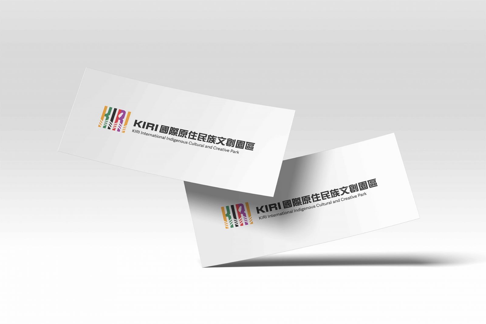
品牌設計|KIRI國際原住民族文創園區
:: 品牌設計 Brand Design ::
#KIRI國際原住民族文創園區
臺灣文化的第一站與最後一站!
從原住民族視角出發,
打造國際旅客了解臺灣的起點與終章,
將文化深植人心,
讓臺灣與原住民族的形象緊密連結。
▞ 四大品牌主軸 ▞
文創 ✧ 潮流 ✧ 美食 ✧ 生活,
集結多元風貌,提供完整的旅遊與文化體驗。
同時,「南島特色選品店」展現原住民手作商品的細膩與創意,
帶動桃園青埔高鐵特區藝文消費,為區域增添活力!
#KIRI國際原住民族文創園區
臺灣文化的第一站與最後一站!
從原住民族視角出發,
打造國際旅客了解臺灣的起點與終章,
將文化深植人心,
讓臺灣與原住民族的形象緊密連結。
▞ 四大品牌主軸 ▞
文創 ✧ 潮流 ✧ 美食 ✧ 生活,
集結多元風貌,提供完整的旅遊與文化體驗。
同時,「南島特色選品店」展現原住民手作商品的細膩與創意,
帶動桃園青埔高鐵特區藝文消費,為區域增添活力!
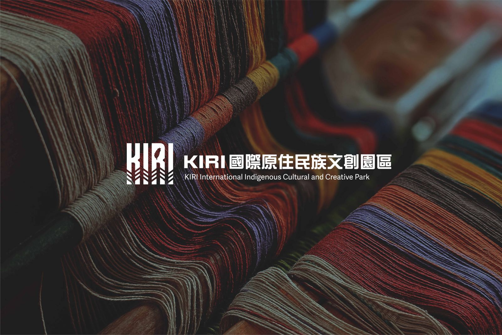
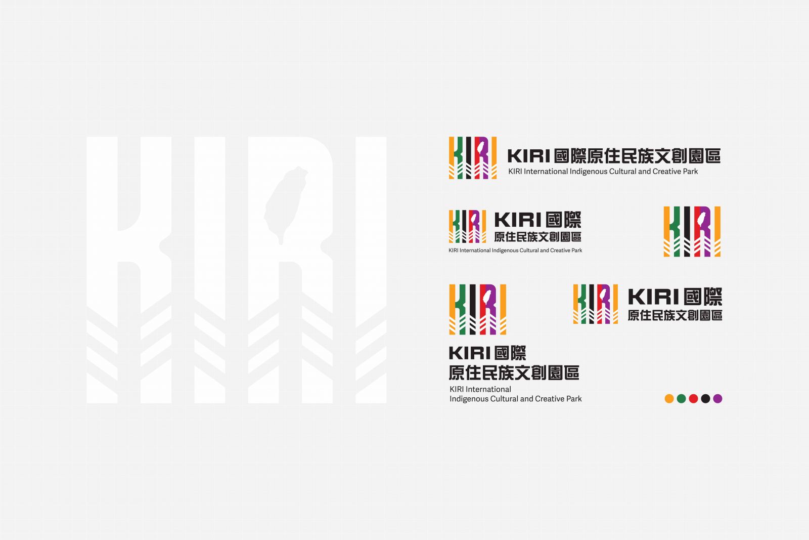
#設計理念 Design Philosophy ⇢ ⇢ ⇢
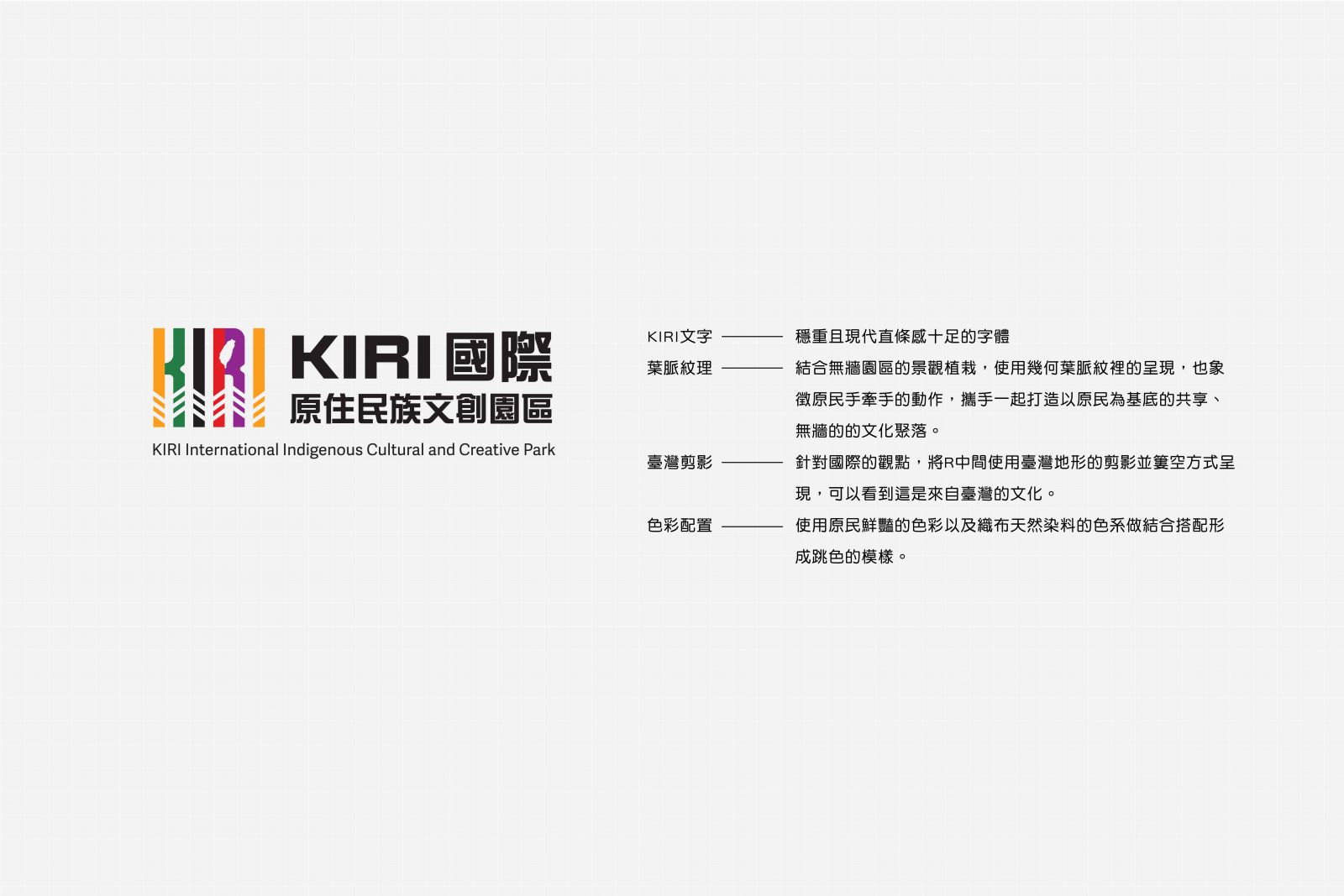
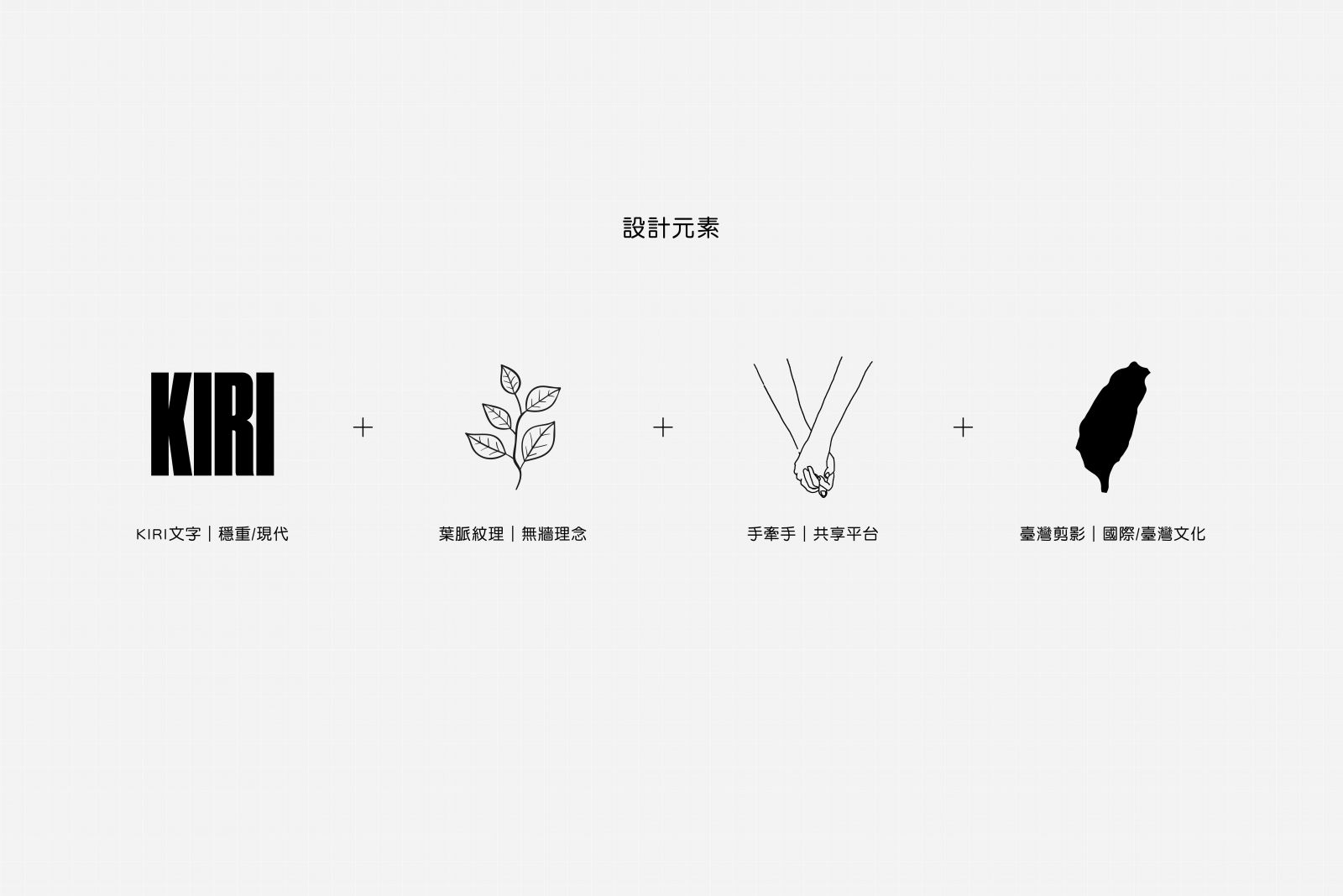
LOGO設計以穩重現代的KIRI字體為核心,
結合原住民鮮豔線條,
為灰黑建築空間注入跳脫的視覺張力。
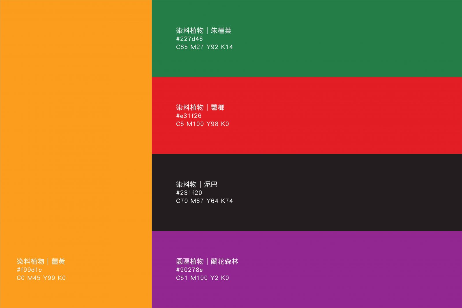
同時,整體設計色彩源於織布的天然染料:
→ 綠:朱槿葉 Hibiscus leaves
→ 黑:泥土 Soil
→ 紅:薯榔 Dioscorea rhipogonioides
▞ 文化與紋路的對話 ▞
字體下方紋路採用幾何葉脈設計,
象徵原住民攜手合作,共建無牆文化聚落。
更在LOGO中融入臺灣地形剪影,
細節裡體現深厚的文化歸屬感。
設計承載文化,文化承載未來!
我們致力於將美好的設計理念轉化為實體作品,
讓故事不僅被看見,更能成為大家心中的永恆記憶。
Brand Identity| 環島走部落有限公司
Client|KIRI國際原住民族文創園區
字體下方紋路採用幾何葉脈設計,
象徵原住民攜手合作,共建無牆文化聚落。
更在LOGO中融入臺灣地形剪影,
細節裡體現深厚的文化歸屬感。
設計承載文化,文化承載未來!
我們致力於將美好的設計理念轉化為實體作品,
讓故事不僅被看見,更能成為大家心中的永恆記憶。
Brand Identity| 環島走部落有限公司
Client|KIRI國際原住民族文創園區
-------------------
#DesignPhilosophy ⇢ ⇢ ⇢
The logo design centers on a modern and robust KIRI typeface,
paired with vivid Indigenous-inspired lines,
injecting dynamic visual contrast into the gray-black architectural space.
The color palette draws inspiration from natural dyes used in traditional weaving:
→ Green: Hibiscus Leaves
→ Black: Soil
→ Red: Yam Vine (Dioscorea rhipogonioides)
▞ A Dialogue Between Culture and Patterns ▞
The geometric leaf vein patterns beneath the typeface symbolize collaboration among Indigenous peoples,
uniting to create a borderless cultural community.
Additionally, the logo subtly integrates the silhouette of Taiwan’s topography,
embedding a deep sense of cultural identity within every detail.
Design Embodies Culture, and Culture Shapes the Future!
We are dedicated to transforming exceptional design concepts into tangible creations,
ensuring that stories are not only seen but also become cherished eternal memories.
Brand Identity|Island Tribe Co., Ltd.
Client|KIRI Indigenous Cultural and Creative Park
Brand Identity|Island Tribe Co., Ltd.
Client|KIRI Indigenous Cultural and Creative Park